ROKIŠKIO MĖSINĖ
VISUAL IDENTITY

THE PROBLEM

Rokiškio mėsinė had products shoppers knew, but a brand they did not always recognise. On Lithuanian supermarket shelves, its packs lacked a consistent identity and were easy to overlook. With different names and designs spread across a broad range, shoppers struggled to see what belonged together or find their way through the choice.

Our solution

We created a packaging identity for the Rokiškio range, with a bow-tied hare as its central character and chef in charge. A symbol of Rokiškis, echoed in the town’s name, the hare connects the butcher’s character to its origins. Lilac, drawn from Rokiškis manor culture, unites the packs, while our redrawn logo and clear product names establish a consistent reading order. A handwritten sign-off adds a personal touch to the character’s portrait. Together, these elements give the range a recognisable family resemblance and help shoppers connect each product to its maker.

Rokiškio mėsinė hare portrait above a manor fireplace
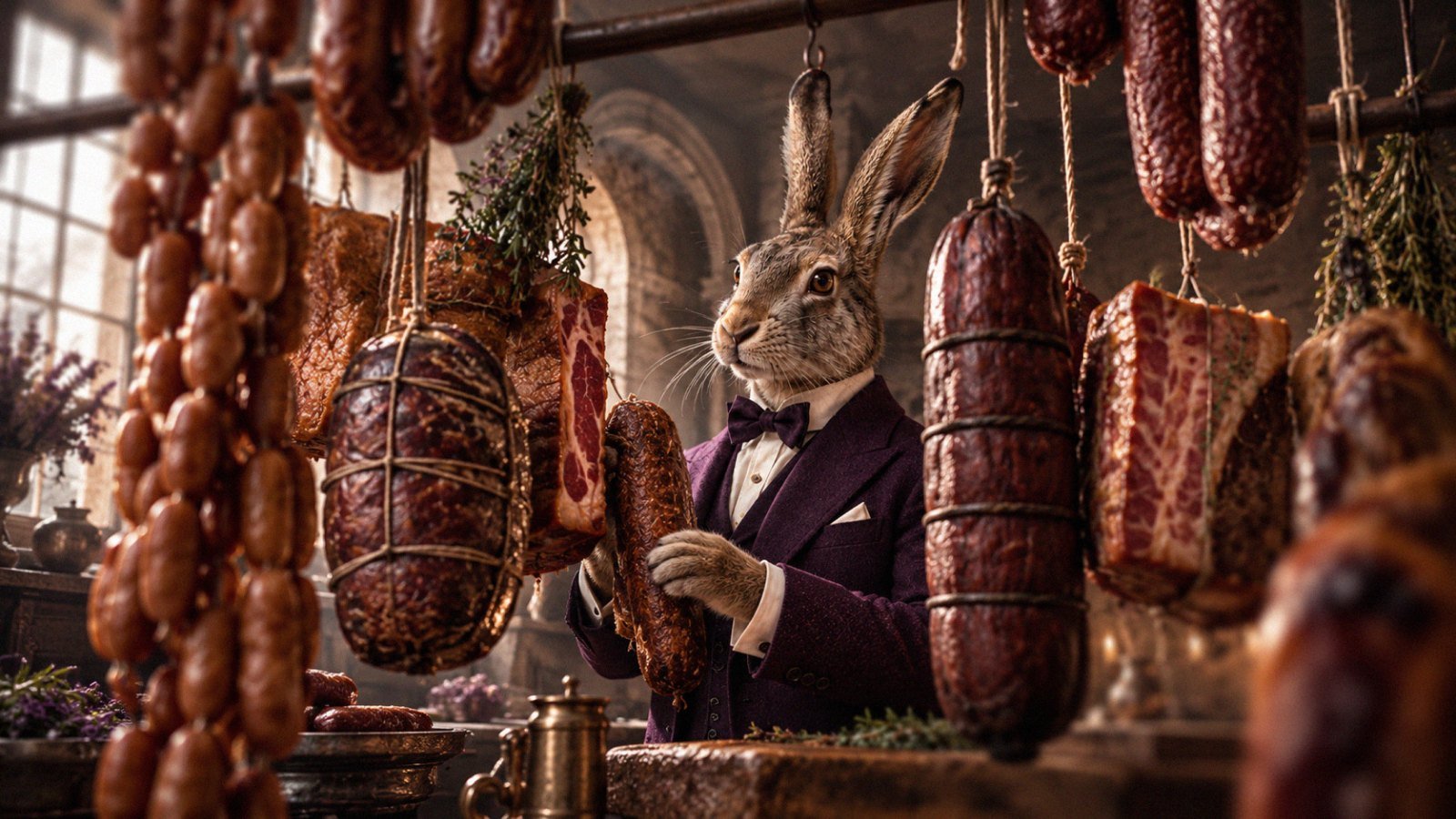
Rokiškio mėsinė hare chef in a butcher's shop among hanging sausages
Rokiškio mėsinė Pieniškos sausage pack held by the hare
Rokiškio mėsinė Pieniškos and Medžiotojų sausage packs in a manor garden
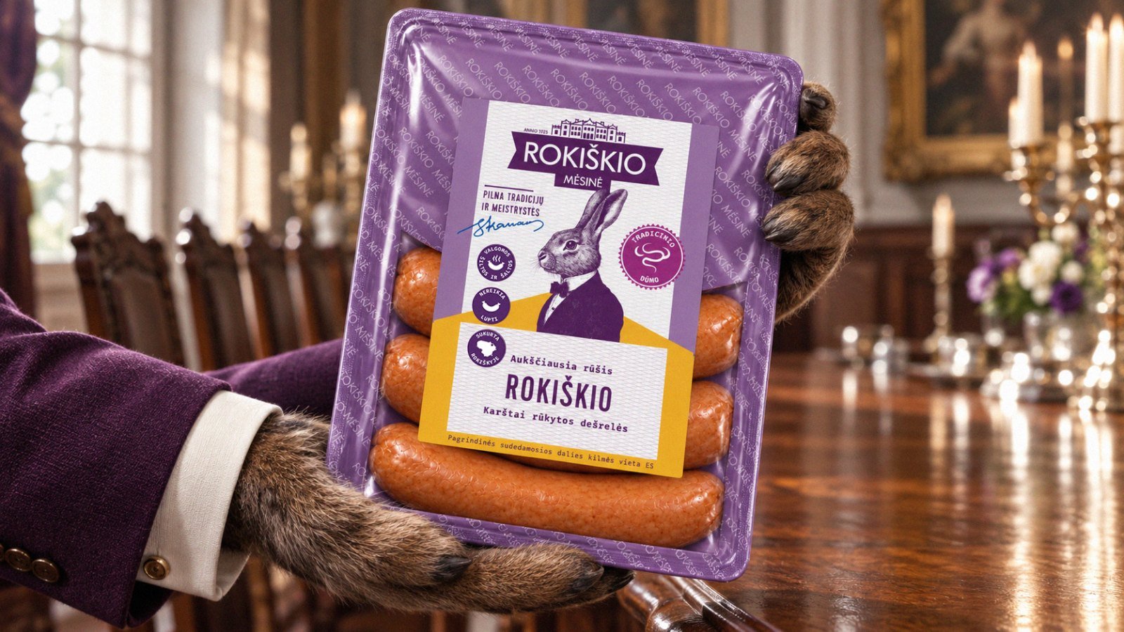
Rokiškio mėsinė sausage pack in a manor dining room
Rokiškio mėsinė Mažai rūkytos sausage pack beside a fireplace
Rokiškio mėsinė Su šonine sausage pack in a music room
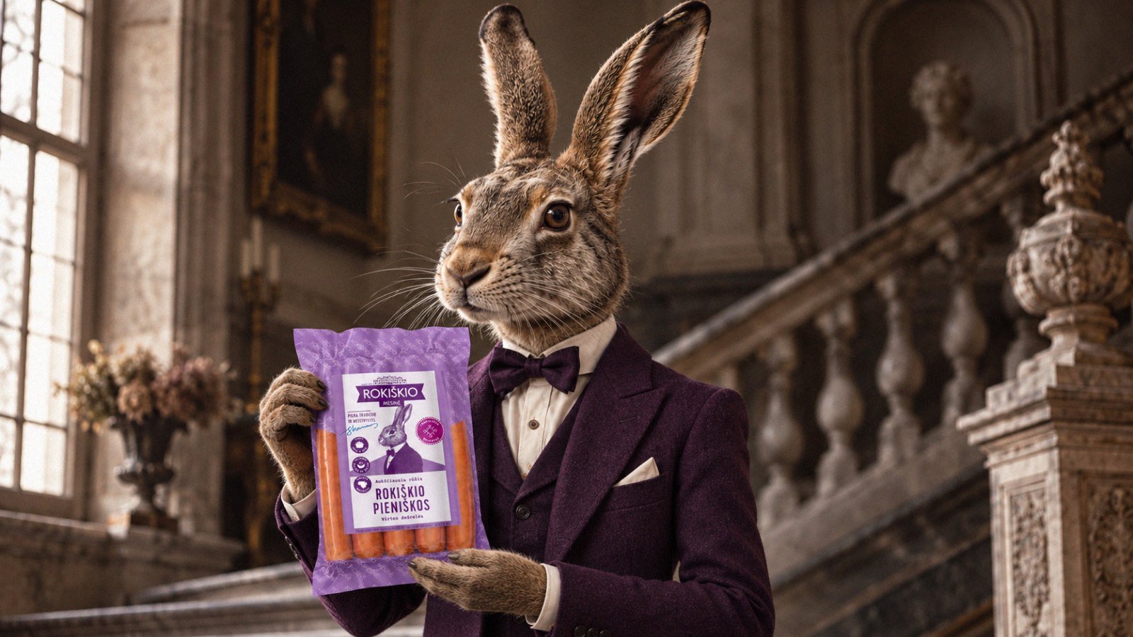
Rokiškio mėsinė hare holding a sausage pack on a manor staircase
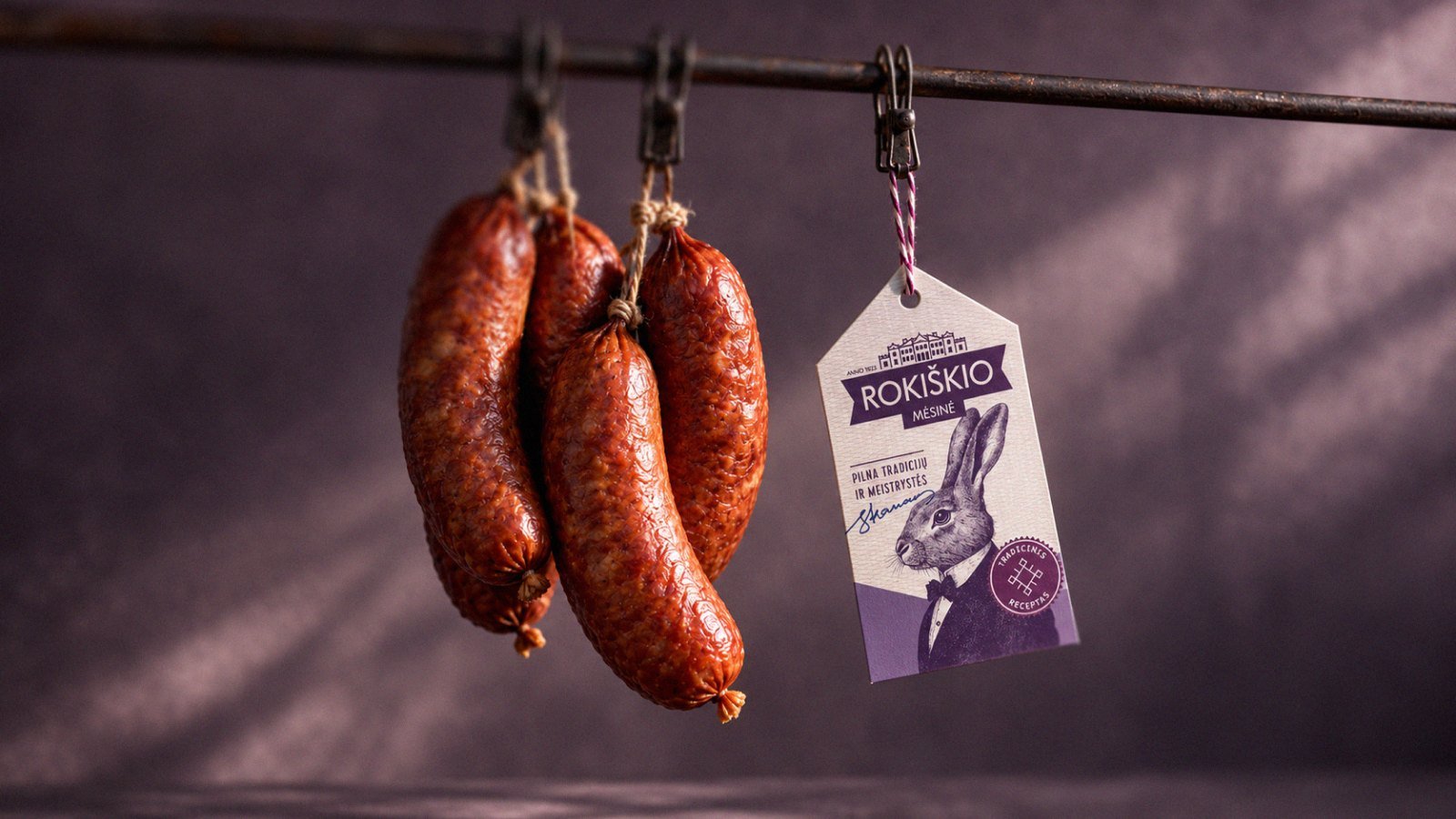
Rokiškio mėsinė smoked sausages with a hanging hare label