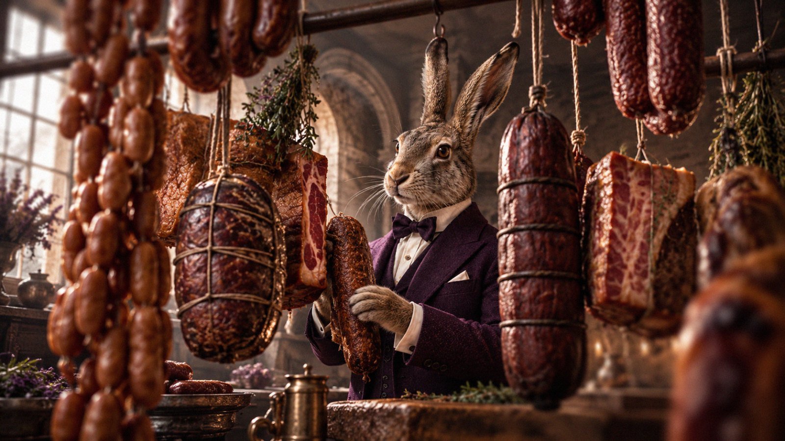
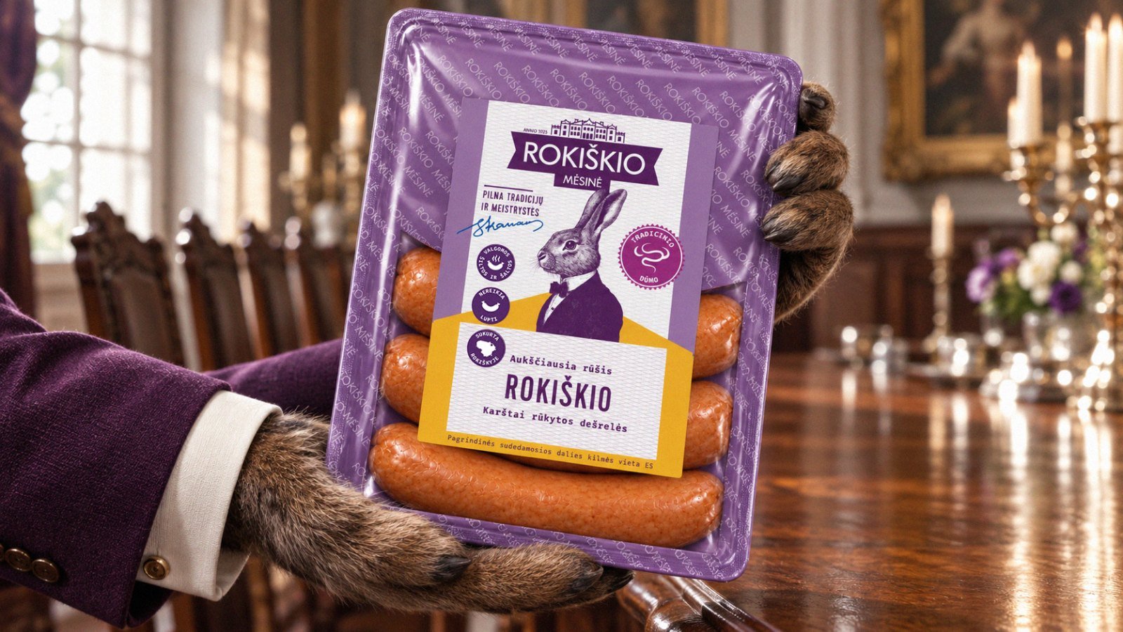
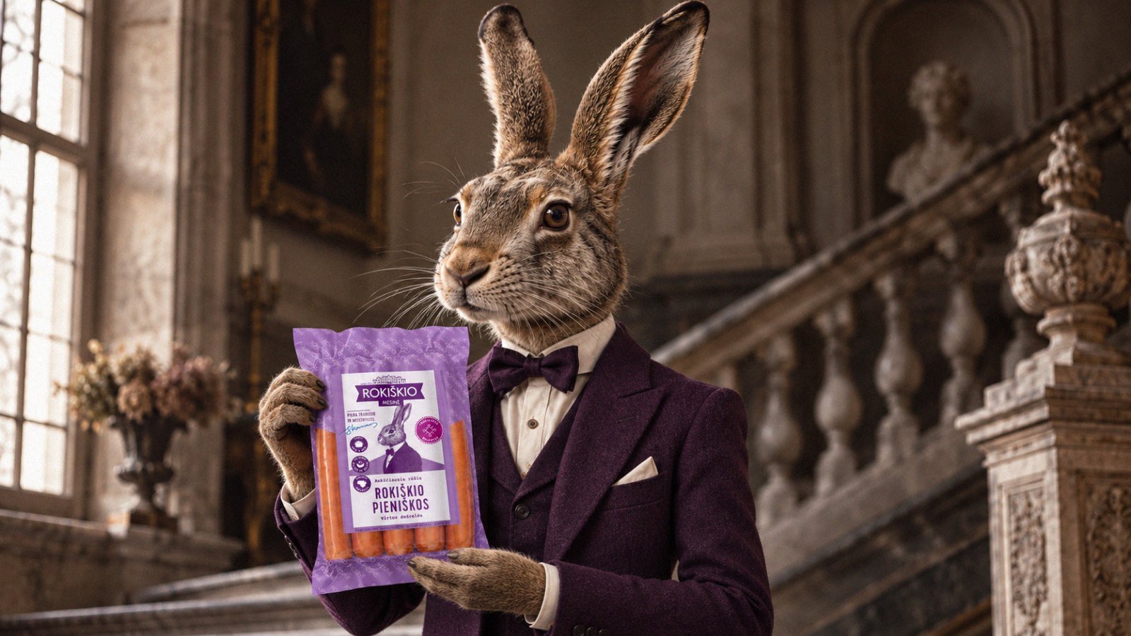
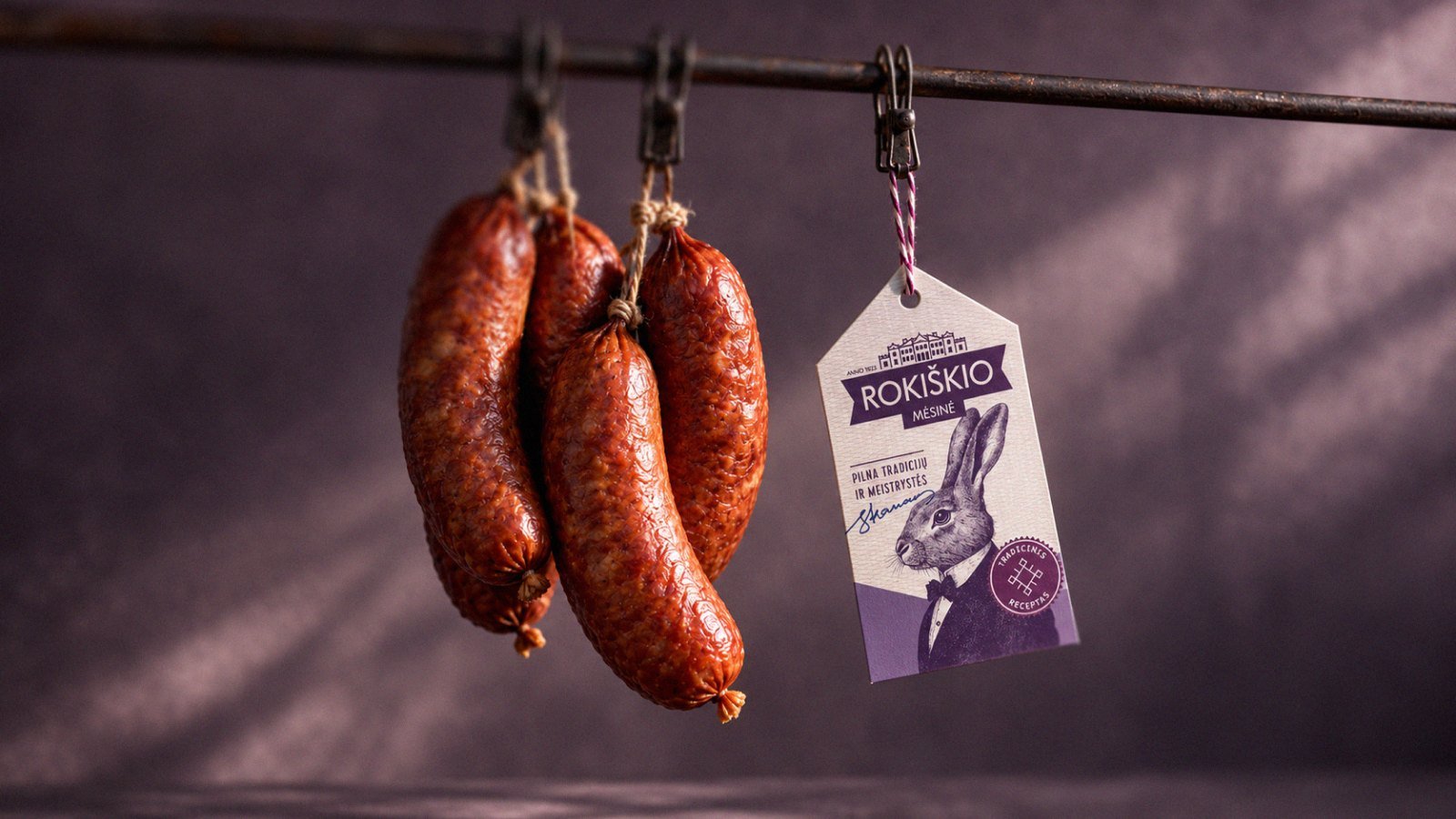
We created a packaging identity for the Rokiškio range, with a bow-tied hare as its central character and chef in charge. A symbol of Rokiškis, echoed in the town’s name, the hare connects the butcher’s character to its origins. Lilac, drawn from Rokiškis manor culture, unites the packs, while our redrawn logo and clear product names establish a consistent reading order. A handwritten sign-off adds a personal touch to the character’s portrait. Together, these elements give the range a recognisable family resemblance and help shoppers connect each product to its maker.