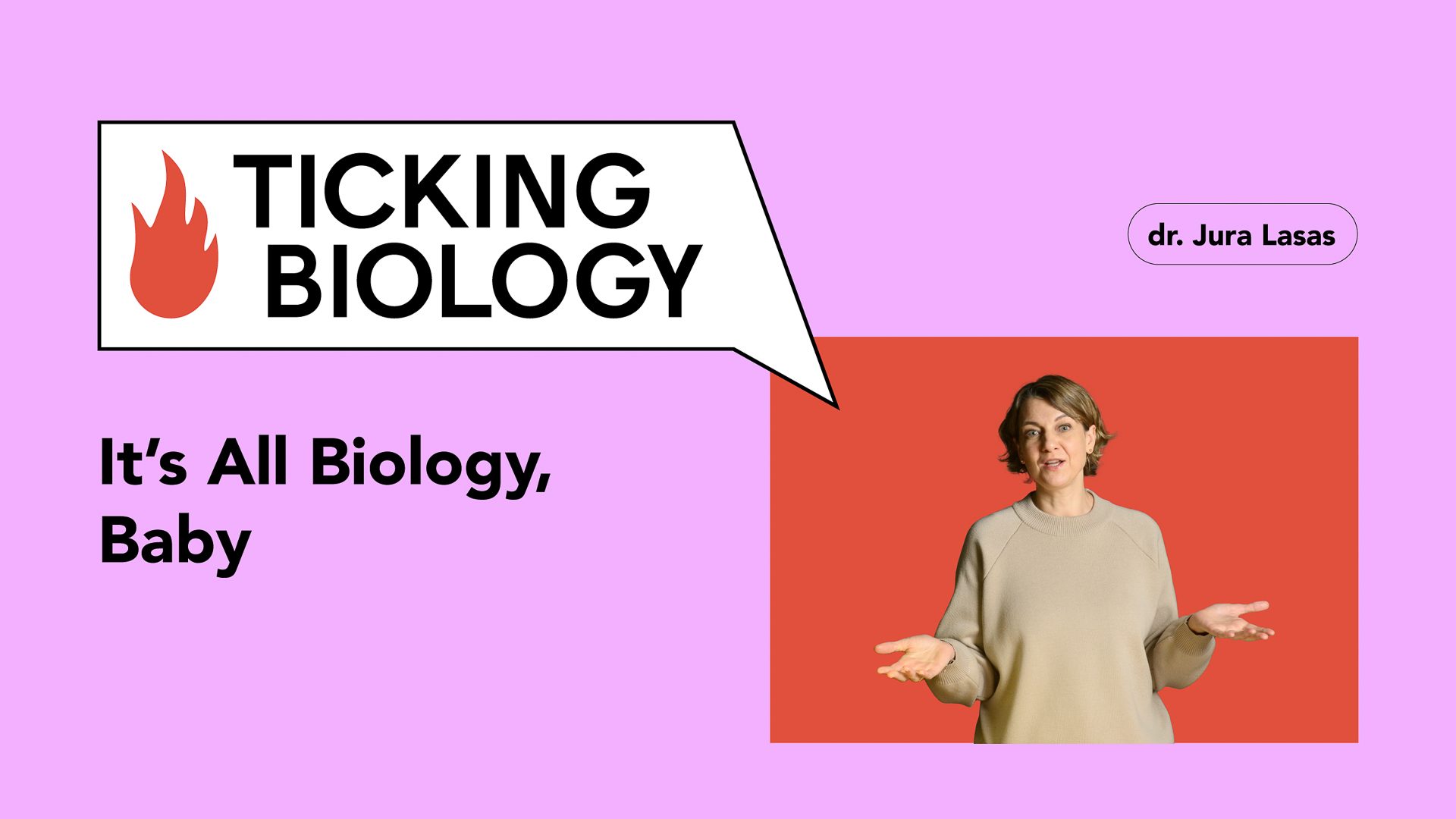
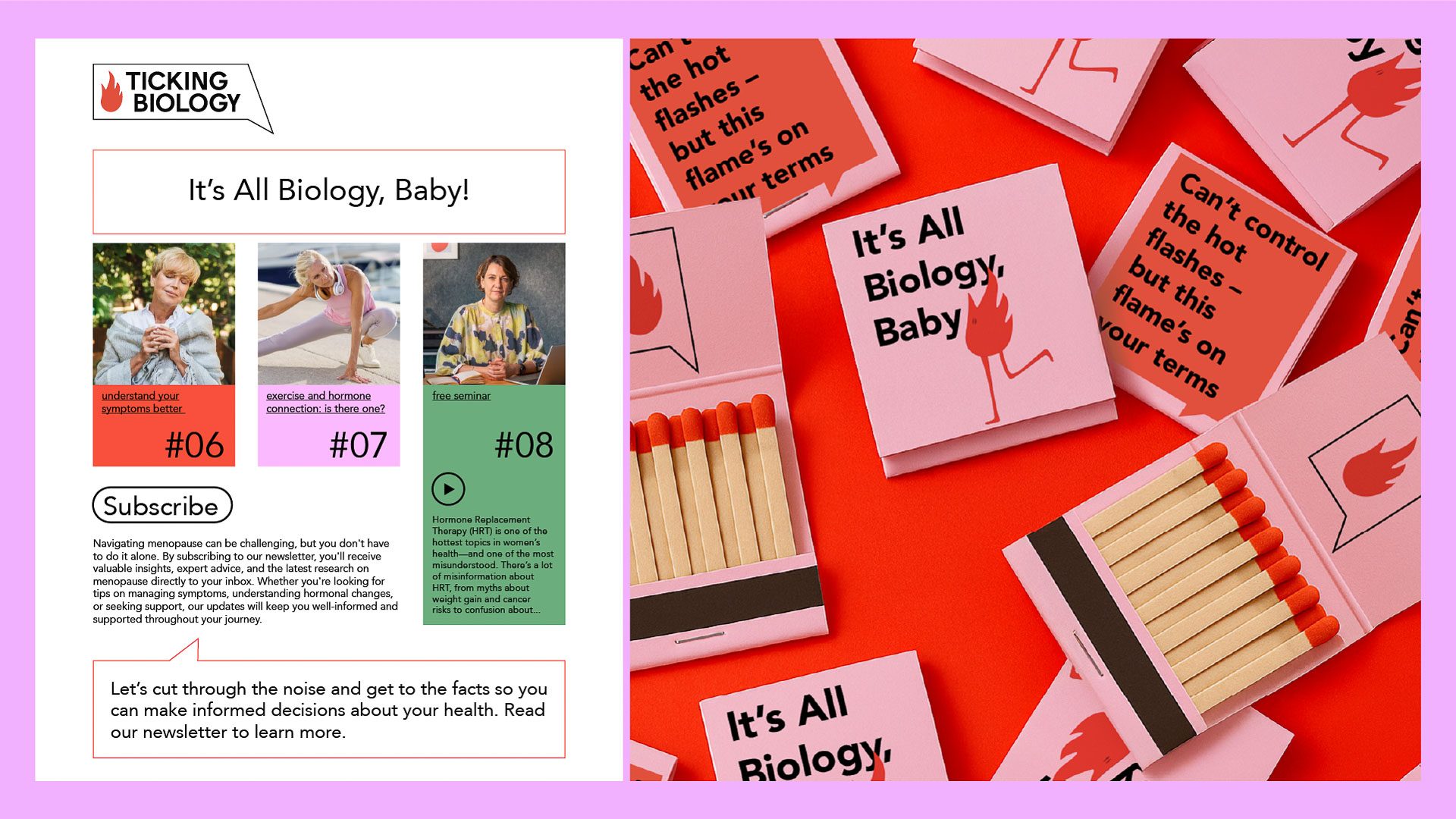
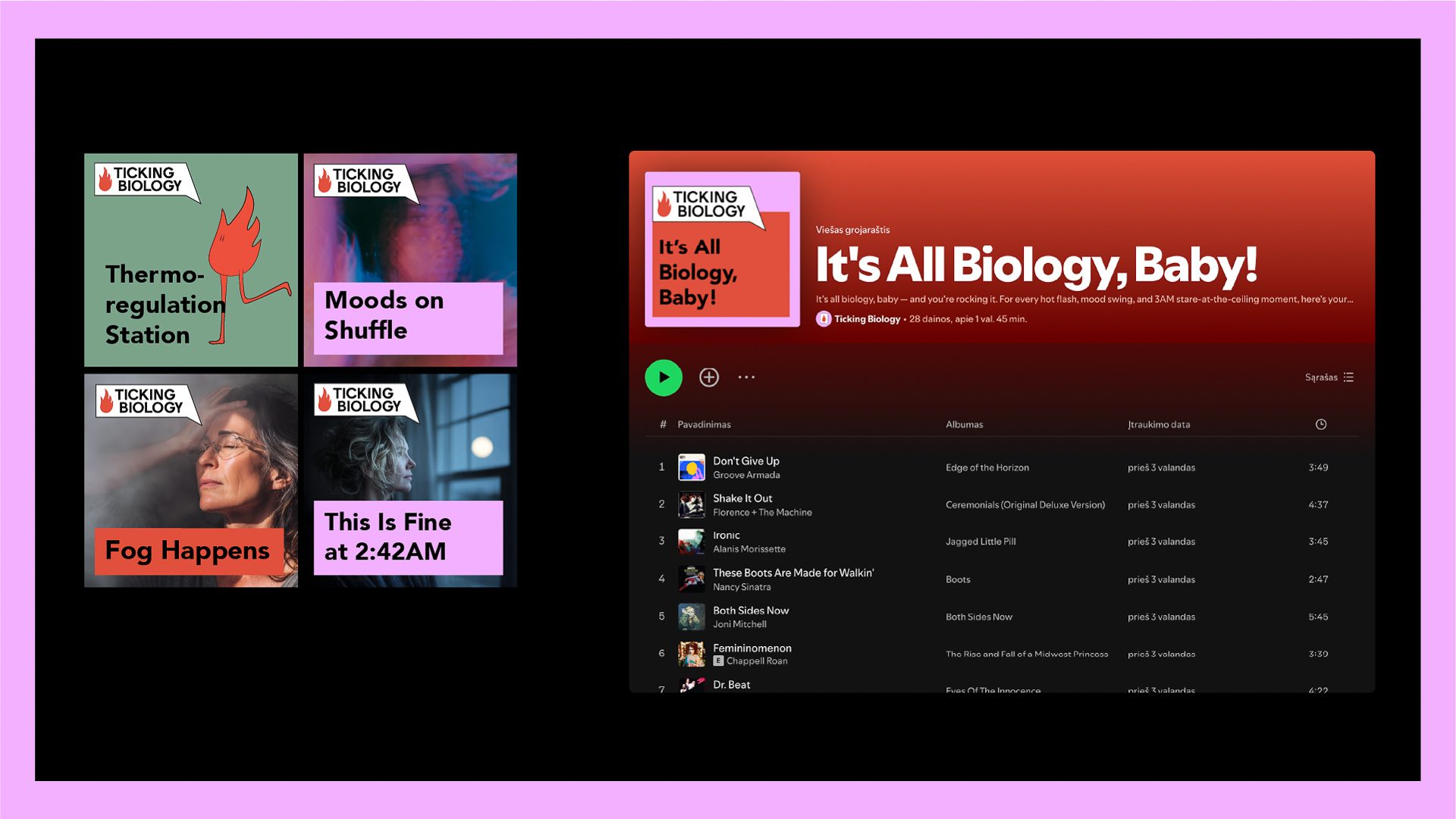
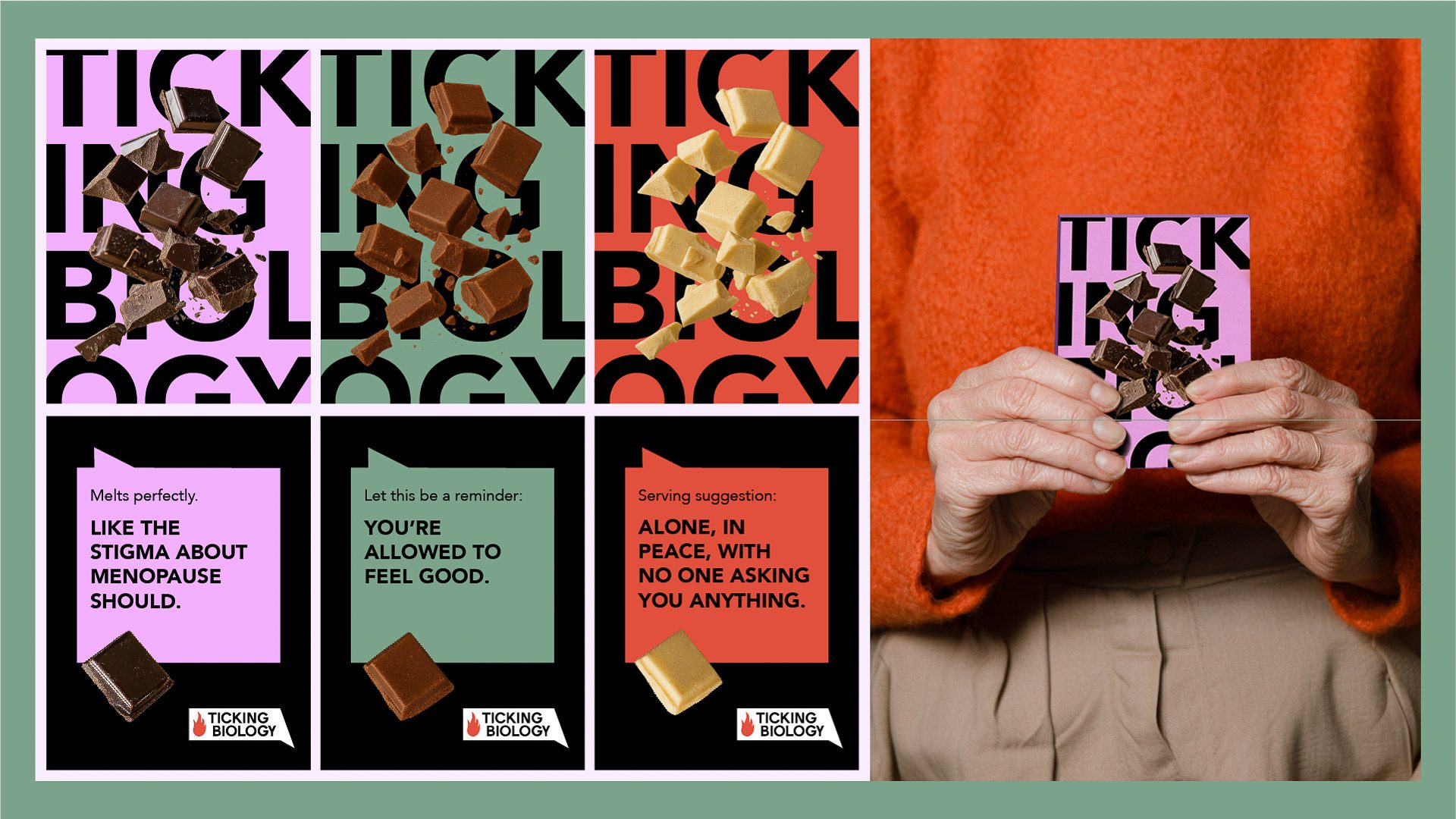
We built the identity around time, science and conversation. The name Ticking Biology says menopause is biology, not a flaw, and the logo blends cues of time and dialogue anchored by a vivid flame – the most iconic symptom, made proud. A feminine but fierce palette makes it visible across feeds and public space, while a typographic system carries evidence-based content and stays easy to read. It launched a brand and started a conversation.