THE PROBLEM

LABU had outgrown the “healthy food” label. To compete as a snack brand and reach a wider audience, it needed to feel more desirable, contemporary and distinctive – without losing the smarter product choice at its core.

Our solution

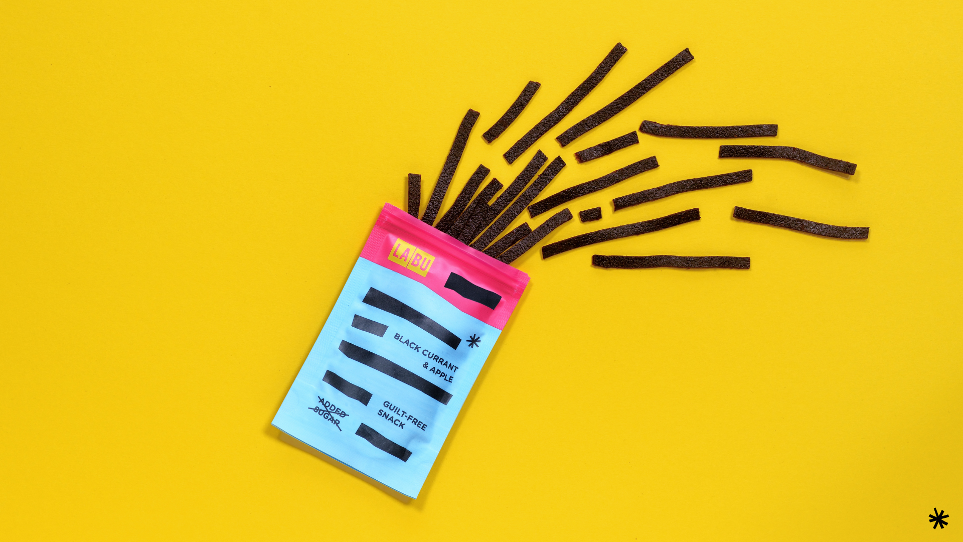
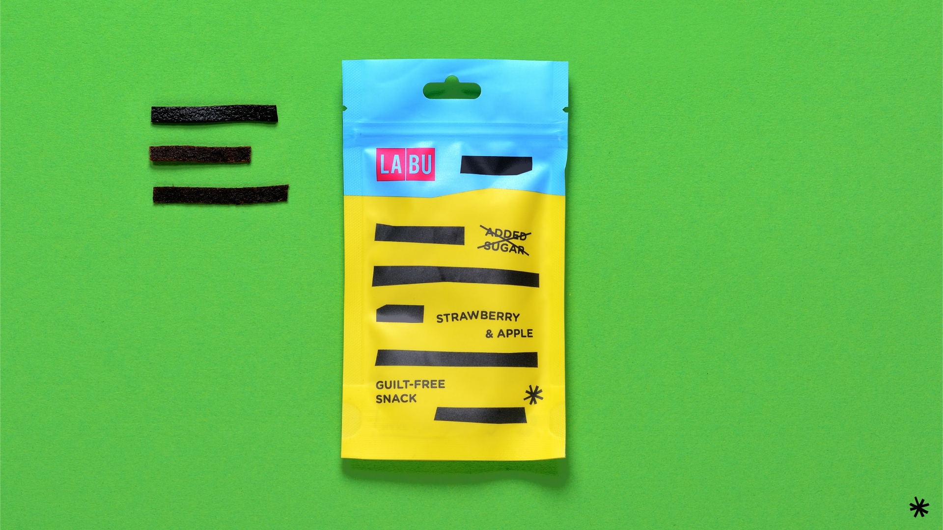
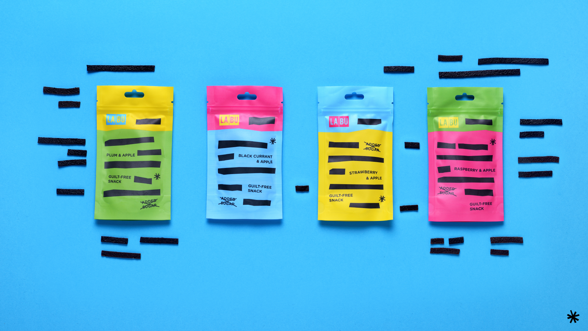
The rebrand shifted LABU from “healthy food” to an “awesome and smarter snack.” Bold colour combinations, direct typography and a playful packaging system gave the brand more attitude and stronger shelf presence. Flexible across flavours and easy to recognize, the new identity helped LABU speak to a broader audience and take a confident step into international markets.
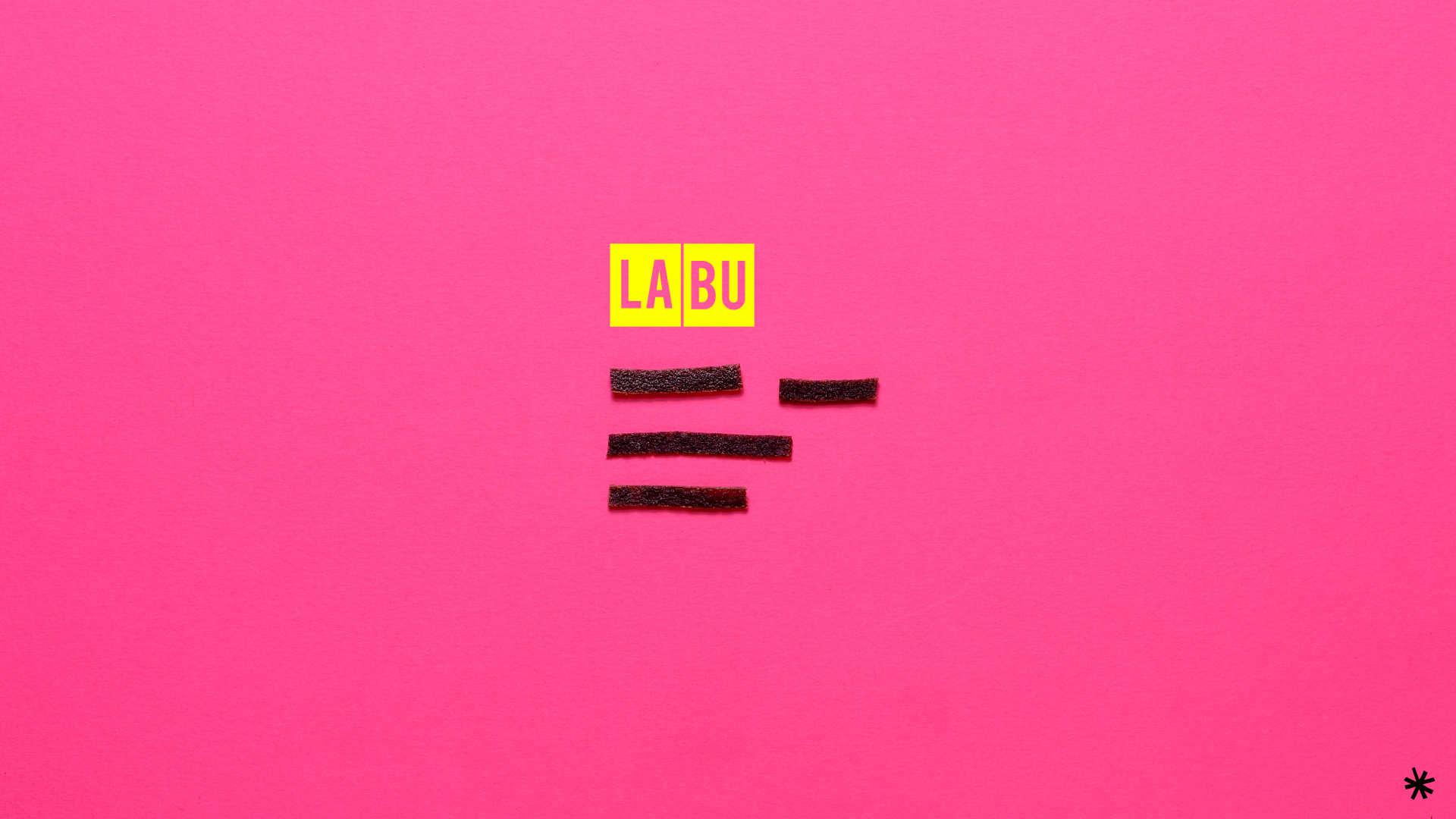
LABU logo and fruit strips on a bright pink background
LABU fruit strip packaging range in four flavours on a blue background
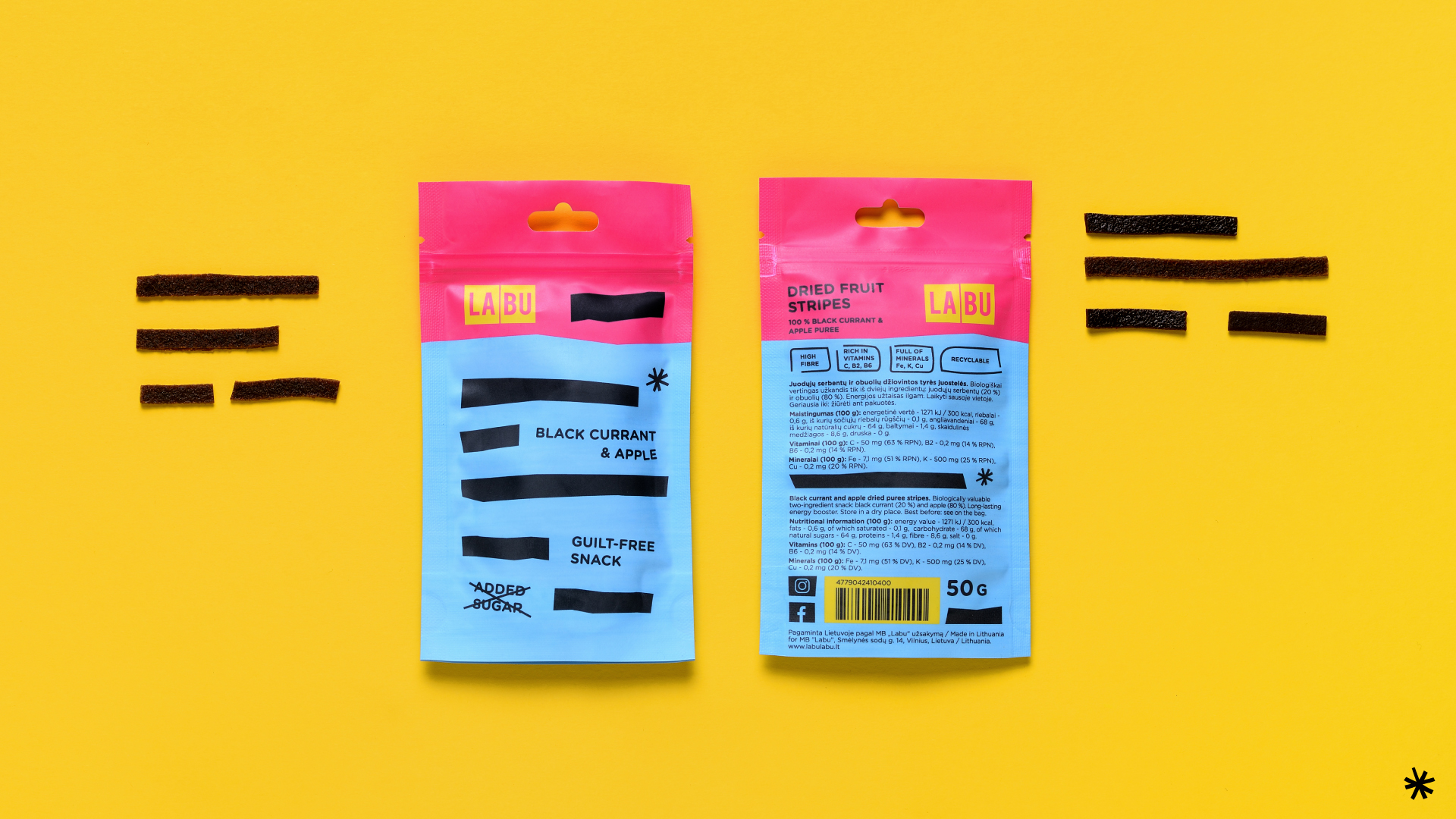
LABU black currant and apple snack packaging with fruit strips on a yellow background
LABU branding and package design
LABU branding