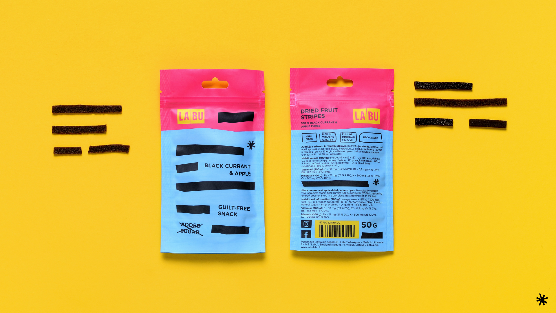
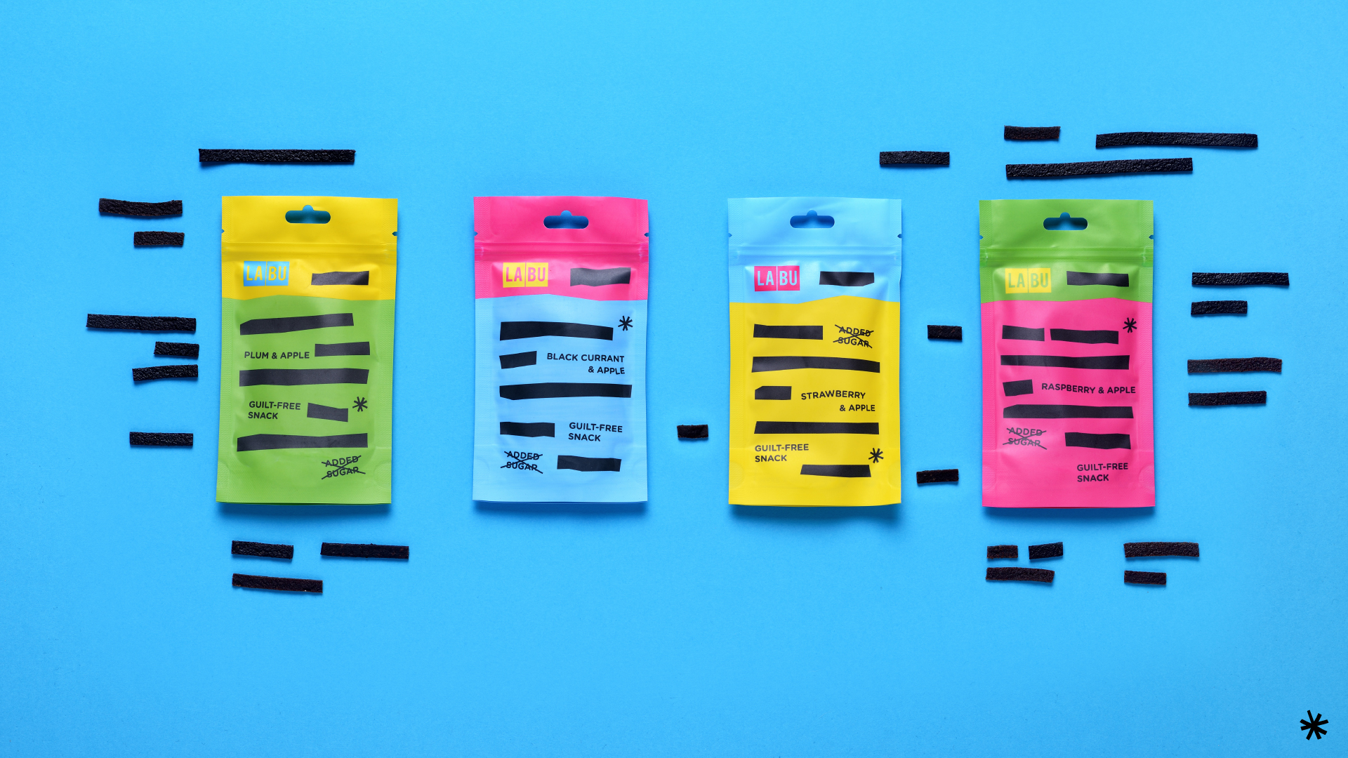
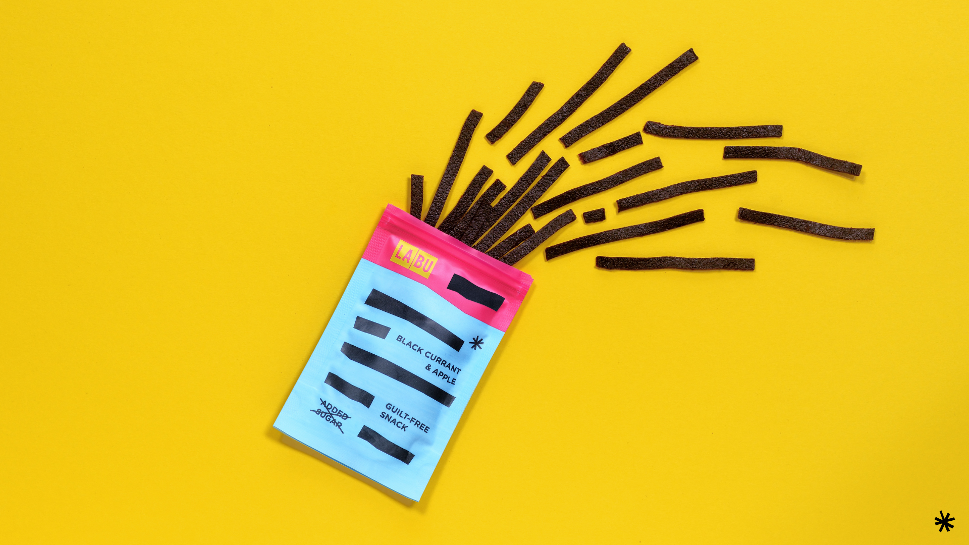
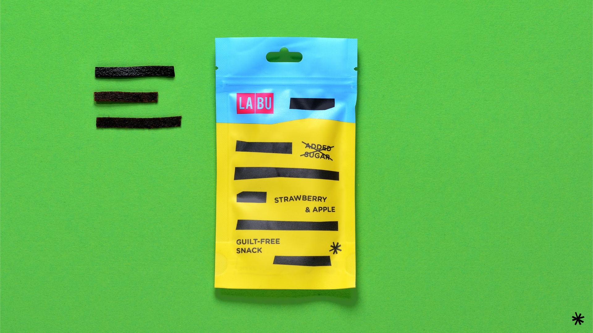
The rebrand shifted LABU from “healthy food” to an “awesome and smarter snack.” Bold colour combinations, direct typography and a playful packaging system gave the brand more attitude and stronger shelf presence. Flexible across flavours and easy to recognize, the new identity helped LABU speak to a broader audience and take a confident step into international markets.