LIGNO LIVING
VISUAL IDENTITY

THE PROBLEM

How do you make timber construction a reason to choose a home? For a new residential development in Riga, the challenge was to turn the qualities of CLT construction into a compelling proposition for homebuyers. The identity had to distinguish ten homes in a competitive market while capturing what construction specialist Kalvasta Timber could bring to life with CLT.

Our solution

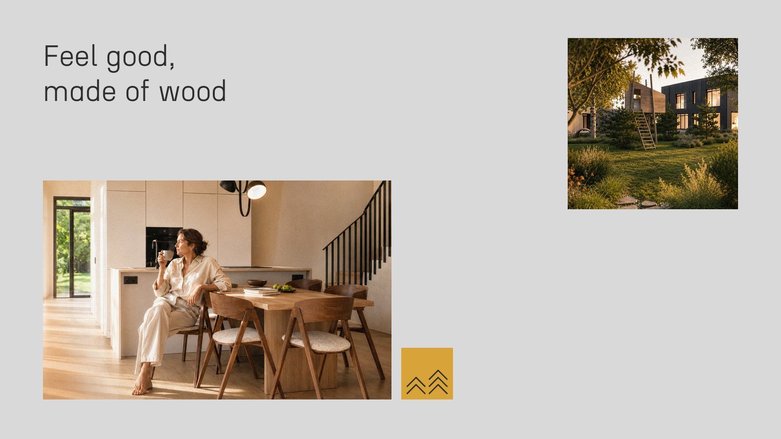
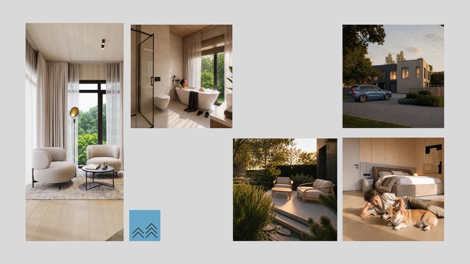
Ligno Living puts wood at the centre of its name, story and identity. “Feel good, made of wood” links the choice of material to the comfort and quality of everyday life. Our geometric tree symbol carries through the layouts, alongside warm photography and clean typography. A clear, editorial tone keeps the focus on the architecture and materials, avoiding the usual eco and luxury clichés.
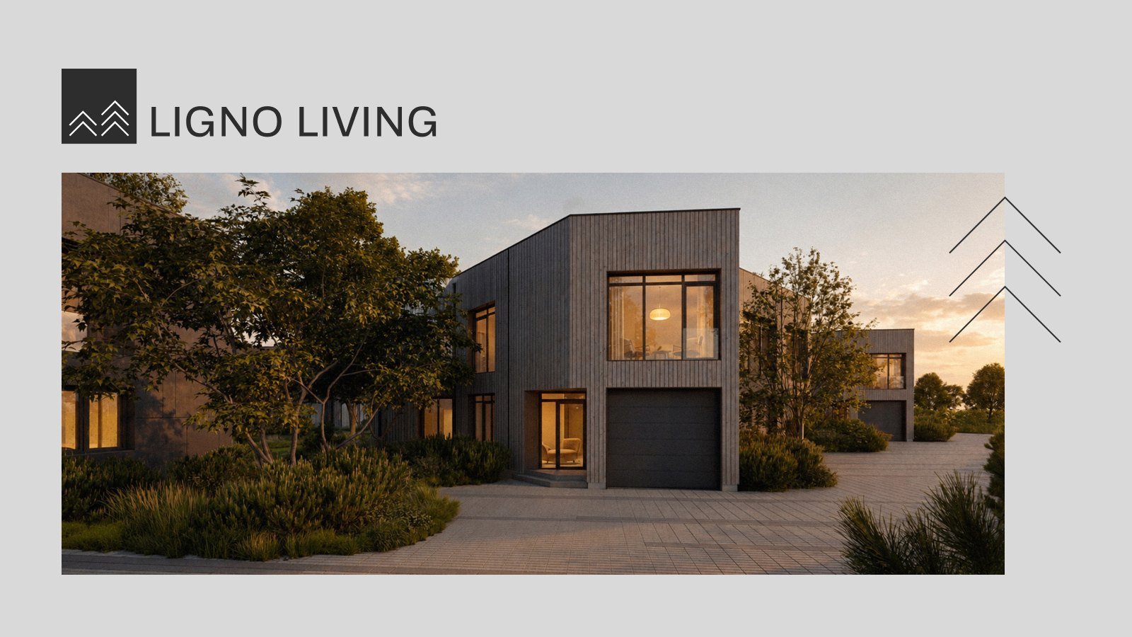
Ligno Living logo with a timber house photograph
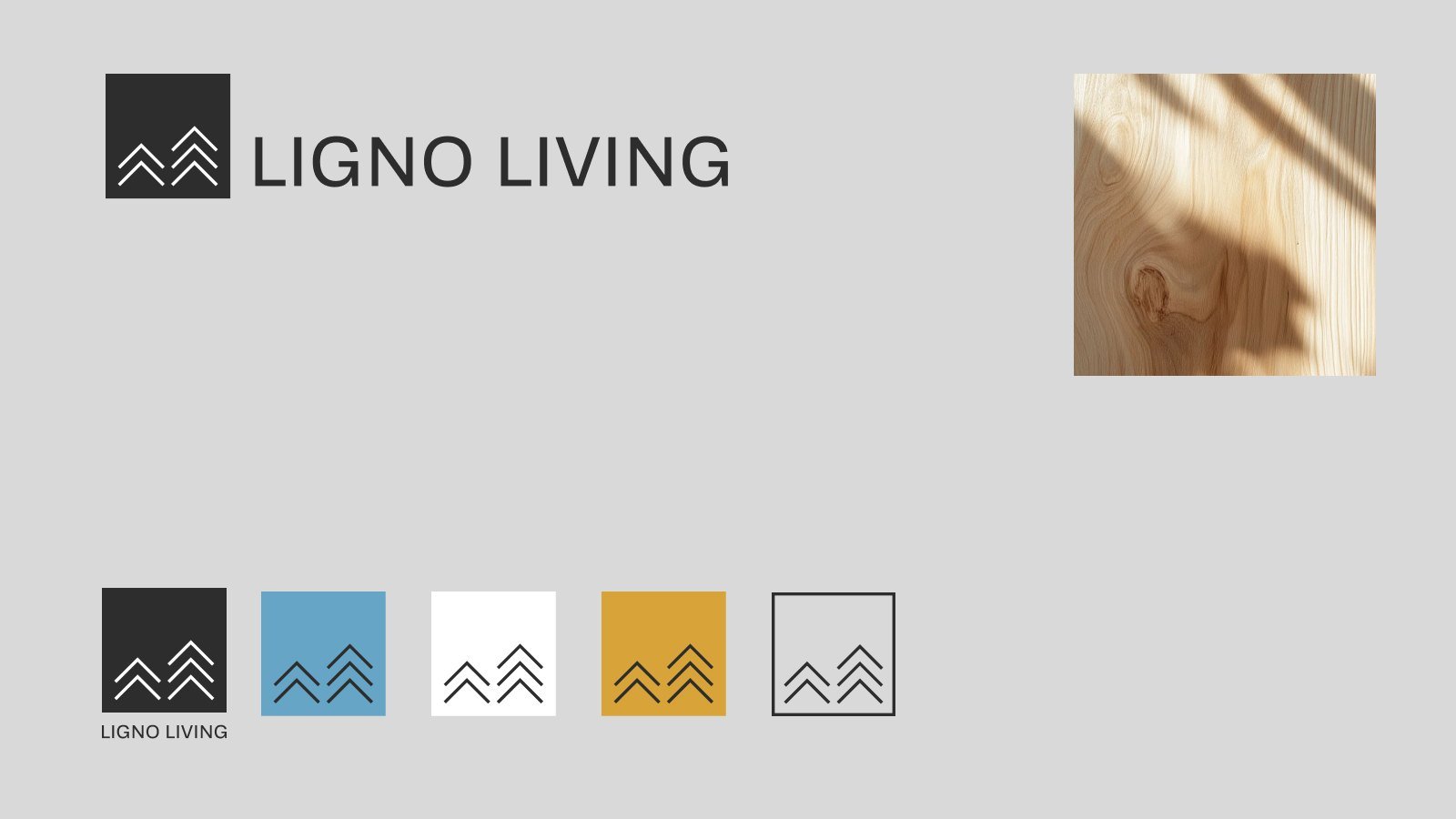
Ligno Living logo, tree symbol variations and colour palette
Ligno Living slogan Feel good, made of wood with interior photography
Ligno Living interior photography layout with the tree symbol
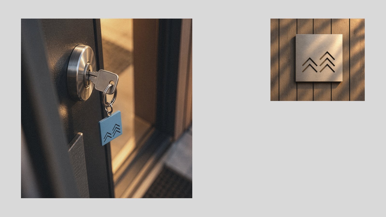
Ligno Living entrance and door signage
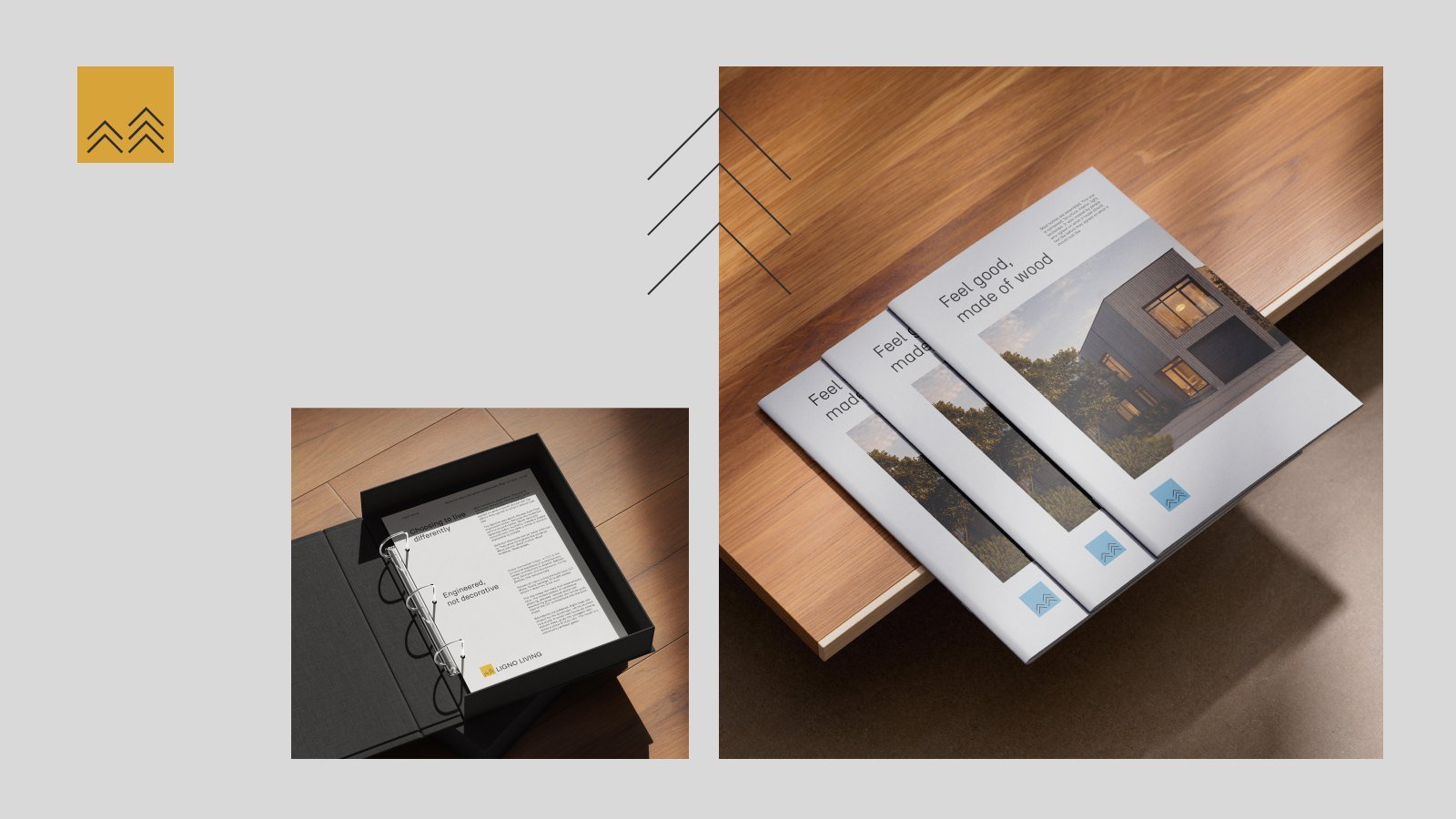
Ligno Living printed brochure and folder mockups