THE PROBLEM

POPUP.LT brings together a constantly changing mix of designers, products and styles. It needed a visual identity strong enough to make the platform instantly recognizable, yet simple enough to let everything featured on it remain in the spotlight.

Our solution

Simplicity became the system. A bold custom logo, primary colours and a flexible graphic symbol give POPUP.LT a distinctive identity without competing with its content. Designed to work across everything from digital platforms to imagery, the visual language stays recognizable while giving every designer and product room to be different.
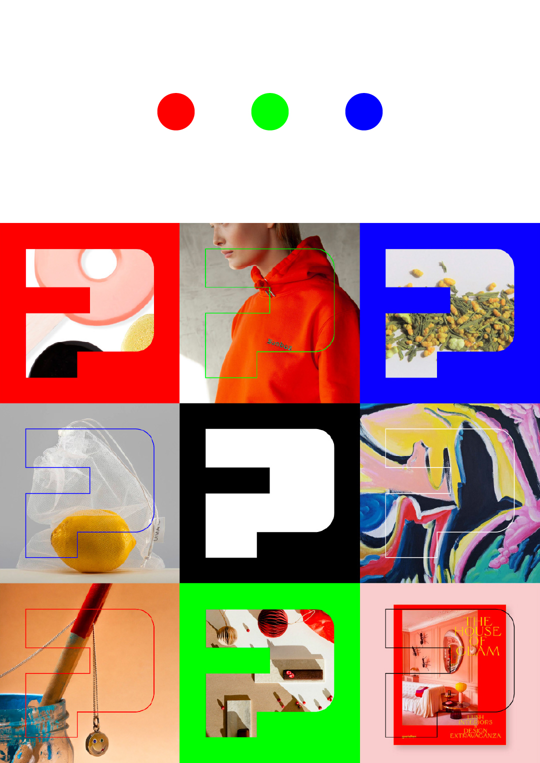
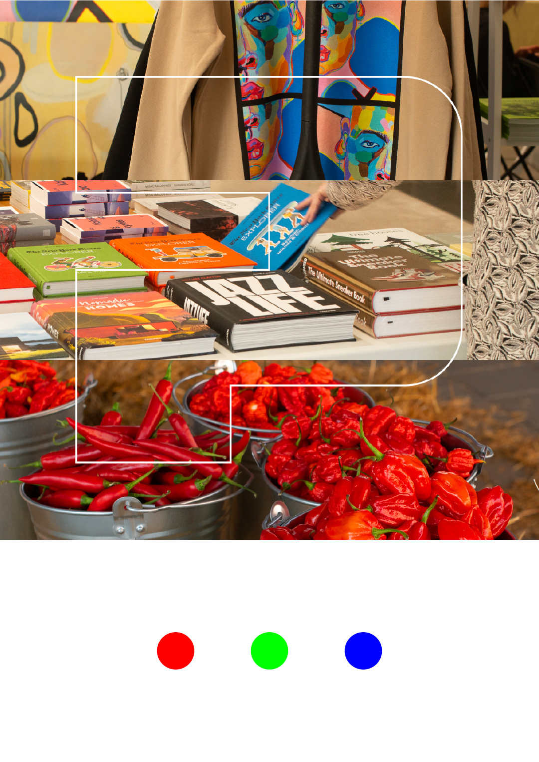
POPUP.LT visual identity featuring the graphic P symbol across colourful design imagery
POPUP.LT visual identity applied to fashion, books and lifestyle photography
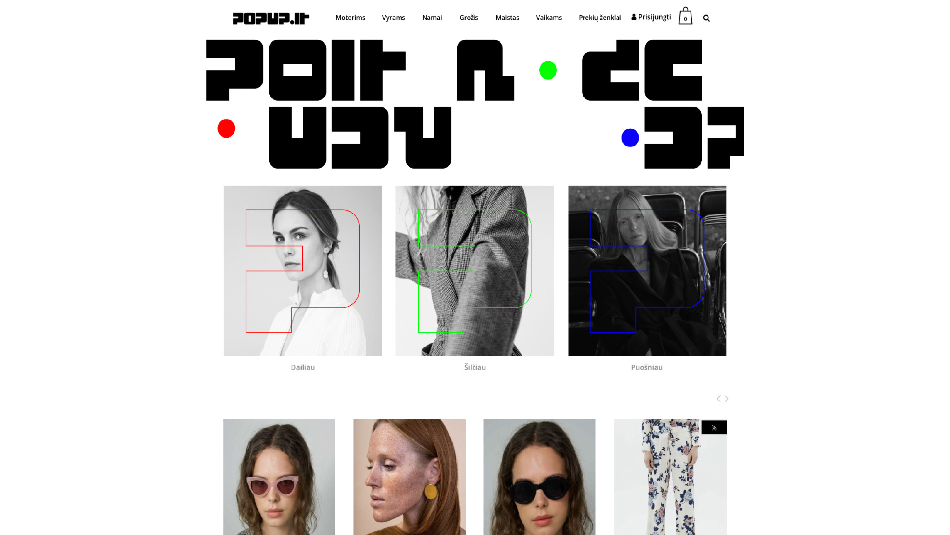
POPUP.LT e-commerce website featuring the new visual identity and custom typography
POPUP.LT white logo on a bold blue background